Work in progress: app redesign
July 26, 2016 in bliss by Dan Gravell
You might have noticed there has been no releases of bliss for a few weeks, or at least certainly longer than I would prefer! I tend to prefer releasing small incremental improvements of bliss, encouraging early feedback for new features, and tend to plan work to achieve that.
However, there are some sorts of features that are difficult to "salami slice" in this way. And what I'm working on at the moment is one such feature: a complete reset of the bliss UI.
You probably noticed in May we released a new look for the website. Well, right now I'm concentrating on getting a new look for the app done and released. Every single page in the bliss app is being ported to a new "template" which gives bliss a more professional, tidy and neat look for a lower cost than getting a designer to design something custom.
Why am I doing this? A number of reasons. In addition to the current design just feeling tired, there are areas which have become untidy over time. In addition, the bliss UI was first written before the days of pervasive mobile device usage. The new UI is fully "responsive" making it easier to use bliss from your couch using your mobile or tablet.
It's worth pointing out what this project is not about. The basic structure of the bliss UI is largely unchanged. Broadly speaking, with one notable exception, there're the same pages, and flow between pages. I don't think this is perfect, but porting the look and feel first of all seems the best thing to do, before making further UI improvements in the future.
What's the "notable exception" I just mentioned? It's the "settings". Rule and library configuration used to be a pull-down panel on each top-level page. It now has its own page.
So I thought I'd now show you around a few choice new pages... let me know what you think below!
Album overview
The album overview retains the same basic idea - a grid of albums:
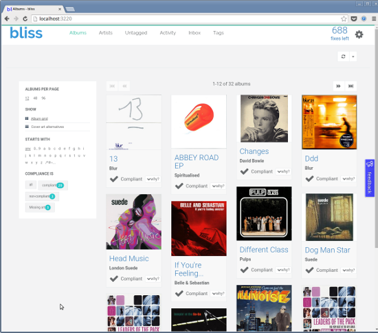
The main change is that the filter options have been moved to the left of the page, to make them more discoverable.
The progress area now takes up the full width, with rescan and clear and rescan to the right. Control over file notification listening using the old "play" and "pause" buttons has been moved to the settings page (see below).
The "why?" buttons are now always visible, because before tablet and mobile users couldn't click them.
Album detail
The album detail page has been cleaned up:
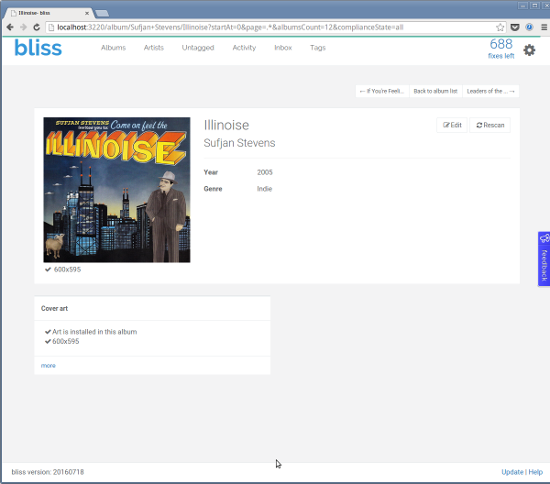
Not much different here, except artwork/information has been switched, and it just generally looks tidier.
Tags
I've worked hard to make the best use of screen real-estate on the Tags page:
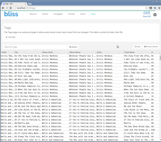
The tags table fully fills the width and remaining height of the page. Otherwise, the buttons are the same as before.
Rule settings
The biggest changes are probably in the settings page:
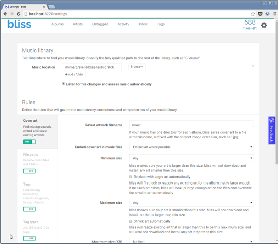
It's accessed via the cog at the top-right corner. Music libraries can be added, as before, under Music library.
In the Rules section, each rule can be enabled/disabled with the ON/OFF slider. Clicking on the rule name and description brings up more detailed settings for that rule.
Not shown on the screenshot is the Apply rules button, hidden down below.
Let me know what you think!
Thanks to for the image above.


